![[Deprecated]](figures/lifecycle-deprecated.svg) This function is deprecated because the new version of specr uses a new analytic framework.
In this framework, you can plot a similar figure simply by using the generic
This function is deprecated because the new version of specr uses a new analytic framework.
In this framework, you can plot a similar figure simply by using the generic plot()
function and adding the argument type = "samplesizes". This function plots a histogram
of sample sizes per specification. It can be added to the overall specification curve
plot (see vignettes).
plot_samplesizes(df, var = .data$estimate, group = NULL, desc = FALSE)Arguments
- df
a data frame resulting from
run_specs().- var
which variable should be evaluated? Defaults to estimate (the effect sizes computed by
run_specs()).- group
Should the arrangement of the curve be grouped by a particular choice? Defaults to NULL, but can be any of the present choices (e.g., x, y, controls...)
- desc
logical value indicating whether the curve should the arranged in a descending order. Defaults to FALSE.
Value
a ggplot object.
Examples
# load additional library
library(ggplot2) # for further customization of the plots
# run specification curve analysis
results <- run_specs(df = example_data,
y = c("y1", "y2"),
x = c("x1", "x2"),
model = c("lm"),
controls = c("c1", "c2"),
subsets = list(group1 = unique(example_data$group1),
group2 = unique(example_data$group2)))
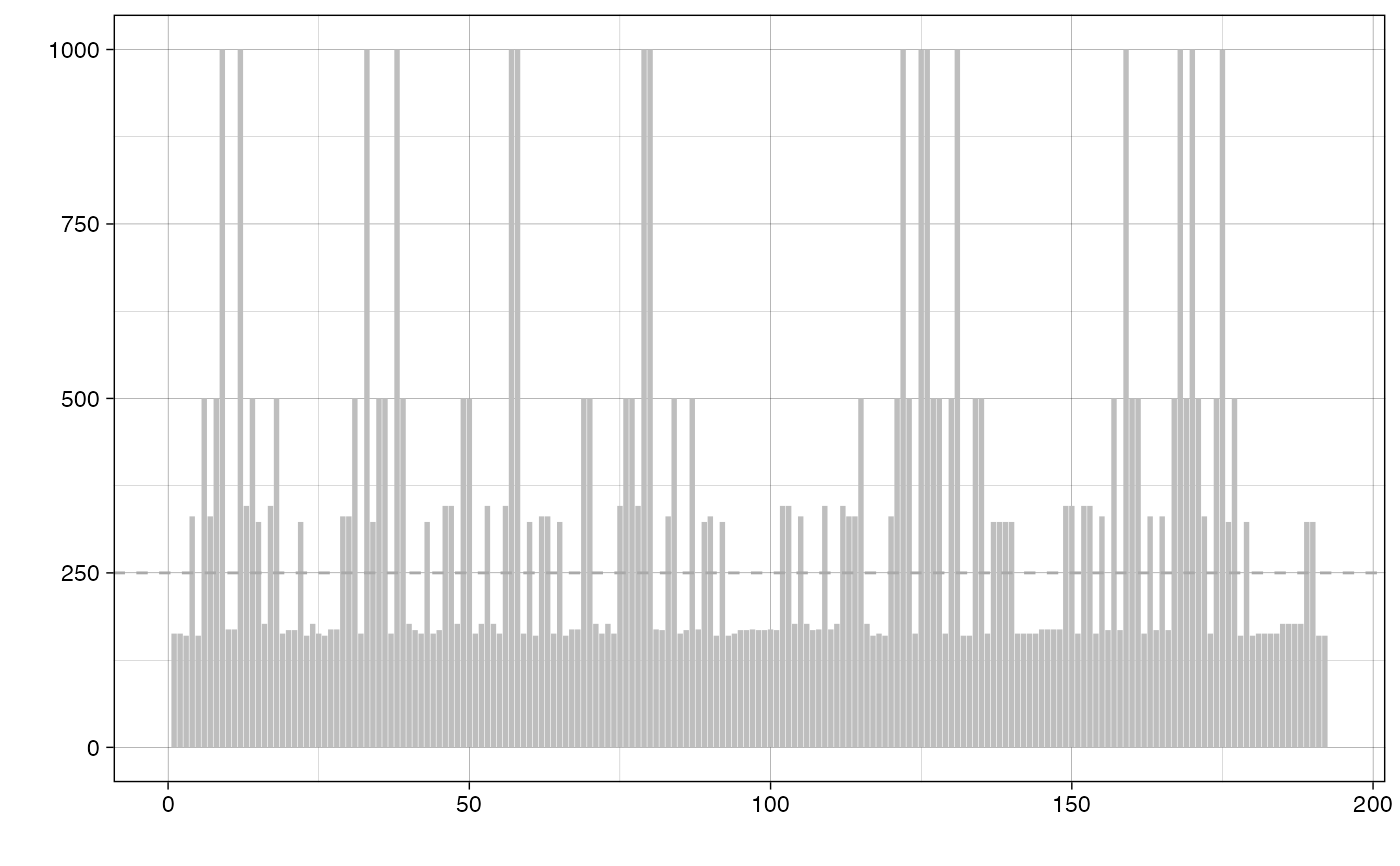
# plot ranked bar chart of sample sizes
plot_samplesizes(results)
#> Warning: `plot_samplesizes()` was deprecated in specr 1.0.0.
#> ℹ Please use `plot.specr.object()` instead.
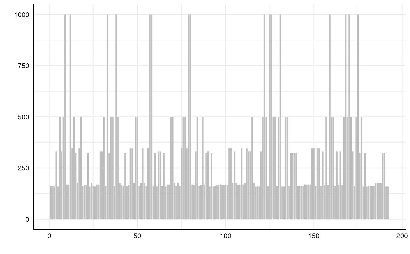 # add a horizontal line for the median sample size
plot_samplesizes(results) +
geom_hline(yintercept = median(results$fit_nobs),
color = "darkgrey",
linetype = "dashed") +
theme_linedraw()
# add a horizontal line for the median sample size
plot_samplesizes(results) +
geom_hline(yintercept = median(results$fit_nobs),
color = "darkgrey",
linetype = "dashed") +
theme_linedraw()