![[Deprecated]](figures/lifecycle-deprecated.svg) This function is deprecated because the new version of specr uses a new analytic framework.
In this framework, you can plot a similar figure simply by using the generic
This function is deprecated because the new version of specr uses a new analytic framework.
In this framework, you can plot a similar figure simply by using the generic plot() function and adding the argument type = "boxplot".
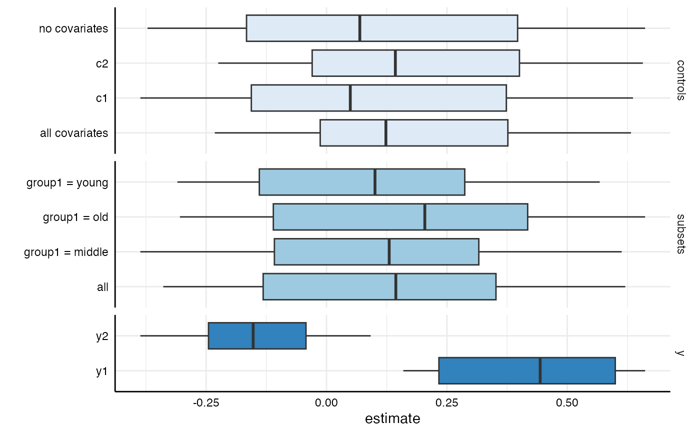
This function provides a convenient way to visually investigate the effect of individual choices on the estimate of interest. It produces box-and-whisker plot(s) for each provided analytical choice.
plot_summary(df, choices = c("x", "y", "model", "controls", "subsets"))Arguments
- df
a data frame resulting from
run_specs().- choices
a vector specifying which analytical choices should be plotted. By default, all choices are plotted.
Value
a ggplot object.
See also
summarise_specs() to investigate the affect of analytical choices in more detail.
Examples
# run spec analysis
results <- run_specs(example_data,
                     y = c("y1", "y2"),
                     x = c("x1", "x2"),
                     model = "lm",
                     controls = c("c1", "c2"),
                     subset = list(group1 = unique(example_data$group1)))

# plot boxplot comparing specific choices
plot_summary(results, choices = c("subsets", "controls", "y"))
#> Warning: `plot_summary()` was deprecated in specr 1.0.0.
#> ℹ Please use `plot.specr.object()` instead.